Visualising survey data with charts and graphs
Bo and Cara are excited to create industry booths that capture visitors’ interest and answer their questions. Learn how Bo and Cara turn the student survey they’ve collected into charts and graphs to help their planning…


Bo and Cara, two of the Salty Creek Community Festival advisors, are busy planning the festival’s industry booths. They want to know more about the local high school students so that they can tailor the booths to match students’ interests. Cara drafted the following survey and visited three high schools in Salty Shire to talk about the festival and collect data from the students there.
2. Are you planning on continuing your studies after high school?
○ Yes, in a bachelor degree program
○ Yes, in a TAFE or vocational education program
○ No, I’m going to start working
○ Not sure yet
3. Which industries are you most interested in? Select up to three choices.
☐ Economics
☐ Education
☐ Engineering
☐ Healthcare
☐ Information technology
☐ Marketing
☐ Social services
☐ Visual art and design
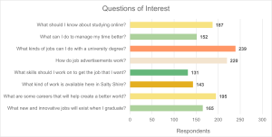
4. Which of the following questions would you like to explore? Select all that apply.
☐ What should I know about studying online?
☐ What can I do to manage my time better?
☐ What kinds of jobs can I do with a university degree?
☐ How do job advertisements work?
☐ What skills should I work on to get the job that I want?
☐ What kind of work is available here in Salty Shire?
☐ What are some careers that will help create a better world?
☐ What new and innovative jobs will exist when I graduate?
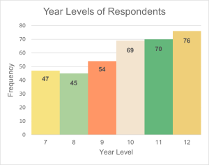
Cara has made a spreadsheet of the survey responses, but with over 300 respondents, the table of data is overwhelming, and it’s difficult to tell which topics were popular with the students.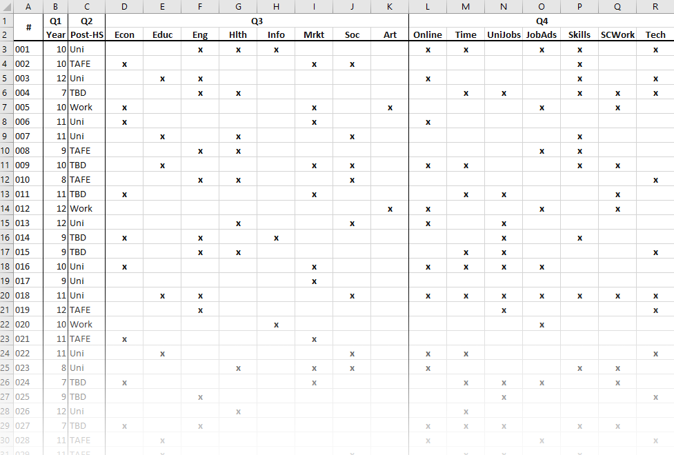
 Bo and Cara decide they need to organise the data visually to really make sense of it. Bo suggests making a chart or graph of the responses for each question and explains that different types of data work best in different types of visualisations.
Read Bo’s explanation of the data gathered and have a look at the charts Bo and Cara create.
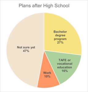
“The second question asks about students’ plans after high school. This is called categorical data, because the answers are categories that aren’t represented by numbers. We usually represent this type of data with a bar graph or a pie chart. For this question, each student could only choose one answer. It’s helpful for us to know what percentage of students picked each answer choice, so a pie chart is a useful way to represent this data.”
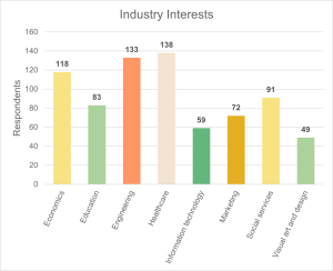
“For the third and fourth questions, we have more categorical data. For these questions, we want to know how many students chose each option, and this time they were able to choose multiple responses. Bar charts can show us which categories were the most popular.
There are different ways to arrange bar charts. For question 3, a vertical bar chart makes sense, but the categories for question 4 have long labels, so a horizontal bar chart might work best here.”
Select the ‘+’ icon to read more about each of the charts and graphs below.
With the survey data analysed, Bo and Cara can now make decisions about what to feature at the industry booths and feel confident that they are meeting the needs and interests of the local high school students. They can even share the charts and graphs they’ve created with Sammie, who is managing the reporting for the festival. Visual representations of data make it easier to convey information in many different academic and career settings, from visualising student progress in education settings to analysing experiment data in science and engineering fields.
- Check out how Sammie uses the data from these charts and graphs to help write a report on the festival’s industry booths. (15 to 20 minutes)
Learn more on Learning Lab
- Read this page about different types of data, and practise your skills with graphs and charts. (10-15 minutes)
- Ready for more advanced data analysis? Check out the Statistics tutorial to learn and practise concepts related to probability, sample distributions, and hypothesis testing.
