Synthesising the data

Synthesis is a stage in the systematic review process where extracted data, that is the findings of individual studies, are combined and evaluated.
The general purpose of extracting and synthesising data is to show the outcomes and effects of various studies, and to identify issues with methodology and quality. This means that your synthesis might reveal several elements, including:
- overall level of evidence
- the degree of consistency in the findings
- what the positive effects of a drug or treatment are, and what these effects are based on
- how many studies found a relationship or association between two components, e.g. the impact of disability-assistance animals on the psychological health of workplaces
There are two commonly accepted methods of synthesis in systematic reviews:
- Qualitative data synthesis
- Quantitative data synthesis (i.e. meta-analysis)
The way the data is extracted from your studies, then synthesised and presented, depends on the type of data being handled.
Qualitative data synthesis
In a qualitative systematic review, data can be presented in a number of different ways. A typical procedure in the health sciences is thematic analysis.
Thematic synthesis has three stages:
- the coding of text ‘line-by-line’
- the development of ‘descriptive themes’
- and the generation of ‘analytical themes’
If you have qualitative information, some of the more common tools used to summarise data include:
- textual descriptions, i.e. written words
- thematic or content analysis
Example qualitative systematic review
A good example of how to conduct a thematic analysis in a systematic review is the following journal article on cancer patients. In it, the authors go through the process of:
- identifying and coding information about the selected studies’ methodologies and findings on patient care
- organising these codes into subheadings and descriptive categories
- developing these categories into analytical themes
Quantitative data synthesis
In a quantitative systematic review, data is presented statistically. Typically, this is referred to as a meta-analysis.
The usual method is to combine and evaluate data from multiple studies. This is normally done in order to draw conclusions about outcomes, effects, shortcomings of studies and/or applicability of findings.
Remember, the data you synthesise should relate to your research question and protocol (plan). In the case of quantitative analysis, the data extracted and synthesised will relate to whatever method was used to generate the research question (e.g. PICO method), and whatever quality appraisals were undertaken in the analysis stage.
If you have quantitative information, some of the more common tools used to summarise data include:
- grouping of similar data, i.e. presenting the results in tables
- charts, e.g. pie-charts
- graphical displays, i.e. forest plots
Example of a quantitative systematic review
A quantitative systematic review is a combination of qualitative and quantitative, usually referred to as a meta-analysis.
About meta-analyses

A systematic review may sometimes include a meta-analysis, although it is not a requirement of a systematic review. Whereas, a meta-analysis also includes a systematic review.
A meta-analysis is a statistical analysis that combines data from previous studies to calculate an overall result.
One way of accurately representing all the data is in the form of a forest plot. A forest plot is a way of combining the results of multiple studies in order to show point estimates arising from different studies of the same condition or treatment.
It is comprised of a graphical representation and often also a table. The graphical display shows the mean value for each study and often with a confidence interval (the horizontal bars). Each mean is plotted relative to the vertical line of no difference.
The following is an example of the graphical representation of a forest plot.
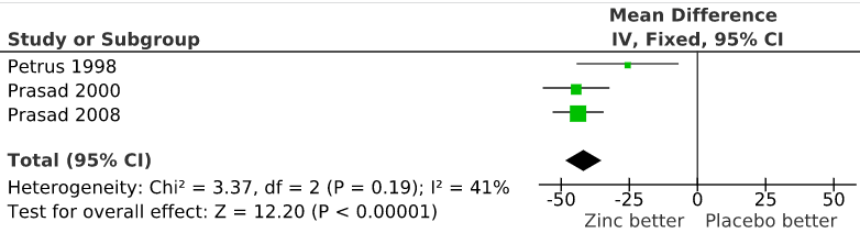
“File:The effect of zinc acetate lozenges on the duration of the common cold.svg” by Harri Hemilä is licensed under CC BY 3.0
Watch the following short video where a social health example is used to explain how to construct a forest plot graphic.
Forest Plots: Understanding a Meta-Analysis in 5 Minutes or Less (5:38 mins)
Forest Plots – Understanding a Meta-Analysis in 5 Minutes or Less (5:38 min) by The NCCMT (YouTube)
Test your knowledge
