Accessible colour
Using accessible colour is important in the media and objects we interact with in everyday life. This enables the greatest number of people to see and understand what is communicated. As explained in the previous sections about vision difference, not everyone can see the same range of colour or light, and some people have other vision problems that make it difficult to see. This is particularly relevant for reading text and for viewing visual communications content like maps, diagrams, charts and infographics that present information in very visual and colourful ways.
If you are a designer working with print or digital media, knowing about accessibility and how to make sure your content is accessible is very useful for creating content that can engage with a wide audience, and promote values like equality and fairness in branding for products and services.
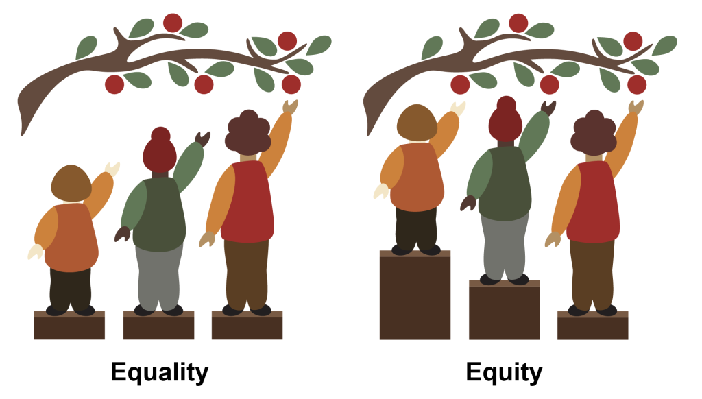
Universal, Inclusive and Equity focused design – what are they?
Universal, inclusive and equity-focused design are concepts and principles that can assist you as a designer. They can ensure you consider all user needs when creating all kinds of products, buildings, online content, and anything that goes through a design process.
- Universal design principles are about making sure your design is accessible to everyone.
- Inclusive design principles include focusing on user groups that might have special needs or who might be otherwise excluded.
- Equity-focused design principles are proactive in working with user groups who are minorities or have special needs to create solutions and form ongoing relationships with those communities.
You can use one or more of these as part of your design methodology. Read this article for more information: Universal, Inclusive and Equity-Focused Design: Why They are Critical for Your Website.
What does this mean for accessible colour in art and design?
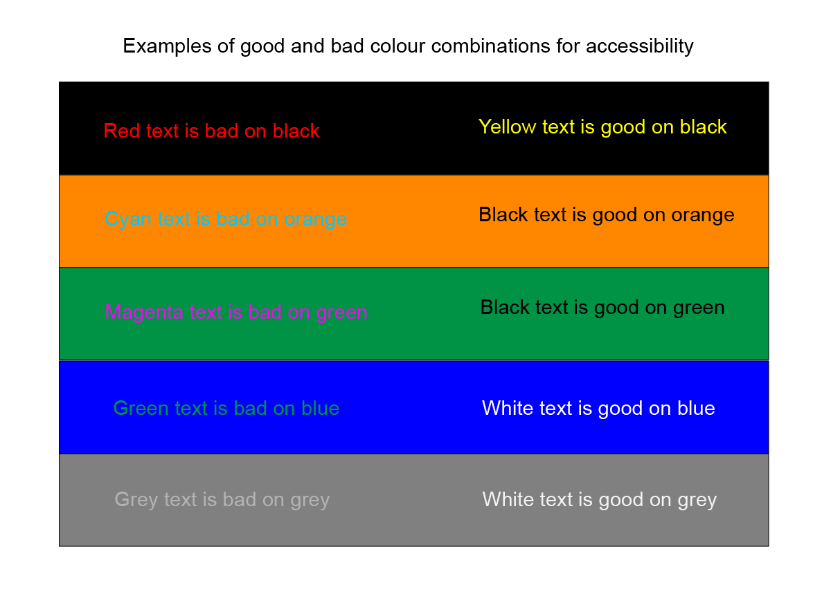
Planning your colour schemes and relationships for creative work should involve careful consideration of accessibility issues that might impact your audience. Examples of accessible colour for both print and digital media include:
- using appropriate contrast (light and dark) in text and background colour
- using colour combinations (hue, saturation and lightness) in text and graphics that people with colour blindness can see
- having enough space around colour elements so they are not confusing to understand
- having text at the appropriate size and weight, or allowing resizable text
- including warnings for moving or flashing colours and images that can trigger seizures in some people.
This Mozilla article gives a good overview of understanding colour accessibility for the Web.
The World Wide Web Consortium (W3C) has a Web Accessibility Initiative (WAI), which develops standards and support materials to help you understand and implement accessibility in your online content.
Activities: using tools and resources for accessible art and design
Activity 1.
Try testing the colours of your own website or print graphics to see if they have good accessibility. If not, how can you tweak your colour palette to have more accessible text and graphics?
There are many free online tools that you can use in your art and design work to check that the colour combinations you are using are accessible and comply with W3C standards. Most of these are checking foreground and background colour contrast for text and graphics. Here are three examples:
Activity 2.
If you’re planning an exhibition or creative event, whether online or in a physical space, make a checklist based on information in the resources listed here. You can work through each item in your checklist to ensure your event has the best accessibility you are able to provide. That might include things like the colour of signs and labels, easy-to-read instructions with adequate fonts, lighting, arrangement of artworks, etc.
These links and resources for artists and designers can help make your creative work more accessible:
- Access Arts resources
- Accessible Arts -accessible exhibition design
- Tangled art & disability – resources
- Arts Access Victoria
- Creative User Projects (Canada)
- Centre for Inclusive Design
- The A11y Project – resources
- W3C standards – accessibility
Activity 3.
Explore this topic further in a real world context in Learning Lab Contextualised Content
