Modern era (c. 1850 to 1980)
Chevreul: 72-colour wheel and perceptual colour
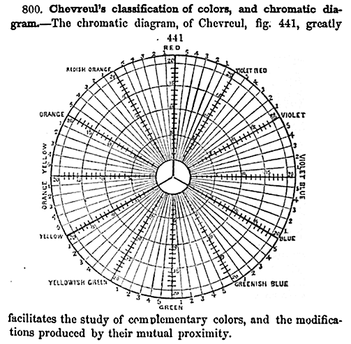
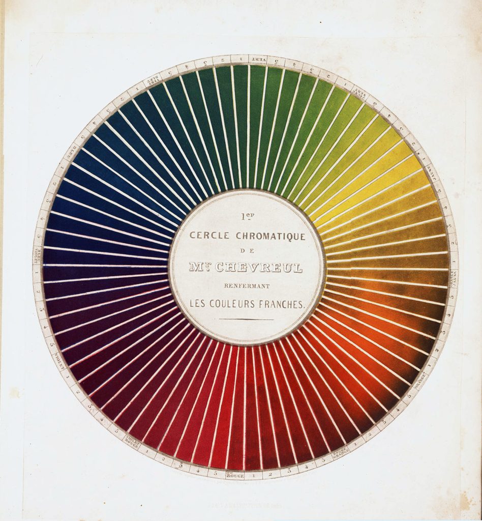
The chemist Michel Eugène Chevreul devised a 72-colour wheel in 1839 (Figures 1.11 and 1.12) which not only showed primary colours, but also showed secondary and tertiary colours, and different brightness levels. He experimented with dyes for carpet manufacture, and through this work, identified the relationships of colours when placed next to each other, and how our perception of colour is relational. His work in the field of optics and the way the human brain interprets colour had an important influence on many art movements, including Impressionism and Orphic Cubism.
Maxwell: RGB primaries and the first colour photograph
Physicist James Clerk Maxwell was the first to suggest that red, green and blue make better primary colours than red, yellow and blue (based on Newton’s theory of the visible spectrum and that red, green and blue light can be used to make all other colours). He also explored colour blindness in his research.
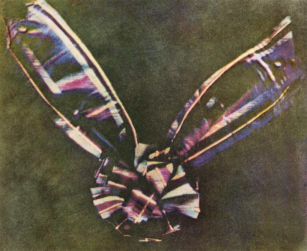
His paper “On the theory of compound colours, and the relations of the colors of the spectrum”[1] in 1860, is recognised as an important contribution to colour theory. He may have also been the first person to take a colour photograph of an object in 1861 (Figure 1.13) by projecting three negatives with red, green and blue coloured lights – as shown in Figure 13.
Rood: perceptual colour blending and the Impressionists
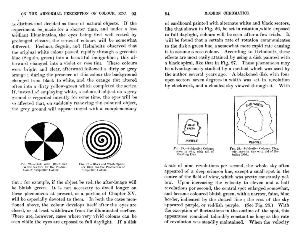
Ogden Nicholas Rood, a physicist, divided colour into three constants: purity, luminosity and hue – similar to Maxwell’s properties of colour. He also developed a theory of contrasting and complementary colours – suggesting that small lines or dots of different colours, when viewed from a distance, blend into a new colour. This work had a great influence on the Impressionist pointillist painters like Georges-Pierre Seurat. Rood published Modern Chromatics, with Applications to Art and Industry[2], in 1879 (Figure 1.14).
The Munsell colour system
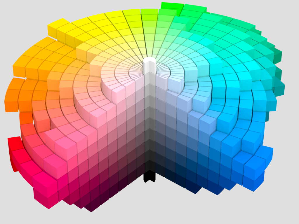
Albert Henry Munsell (an artist and art teacher) developed the Munsell color system in 1915. It is still one of the most-used colour systems – especially in design. His colour system is said to span art and science due to the numbering system he developed to classify colour, which is rigorous enough for scientific use, but also simple enough for artists or those with no scientific background to understand. His system is associated with the word “chroma”, which is the saturation or intensity of hue.
Learn more about the Munsell Color System and Munsell Color company in this publication on Project Gutenberg: A Color Notation by A.H. Munsell, 1905
Ostwald: colour aesthetics, the Bauhaus and De Stijl
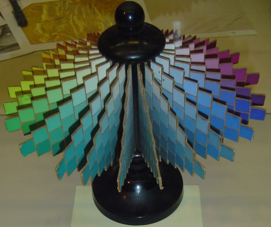
Wilhelm Ostwald (a Nobel prize winner in Chemistry), explored colour harmonies and why some colours look pleasant when placed together and others look unpleasant. He attempted to find a scientific theory for colour harmony – The Colour Primer 1916/1917 was the most notable publication he produced. His perceptual colour system (Figure 1.16) was different to Munsell’s in that he identified Colour-content, White-content and Black-content. Ostwald was associated with the Bauhaus and while his theories did not gain the same popularity or acceptance as Munsell’s, his work influenced many artists such as Piet Mondrian, and other artists of the de Stijl group[3].
- Maxwell, J. C. (1860). "On the Theory of Compound Colours, and the Relations of the Colours of the Spectrum". Philosophical Transactions of the Royal Society of London, 150, 57–84. http://www.jstor.org/stable/108759 ↵
- Rood, O.N., Modern Chromatics With Applications To Art And Industry, 1879 on Archive.org https://archive.org/details/in.ernet.dli.2015.31718/mode/2up . ↵
- Ball, P. and Ruben, M., “Color Theory in Science and Art: Ostwald and the Bauhaus.” Angewandte Chemie (International ed.) 43, no. 37 (2004): 4842–4847, https://www.researchgate.net/publication/8394577_Color_Theory_in_Science_and_Art_Ostwald_and_the_Bauhaus . ↵
Primary colours are the basic set of colours that can’t be mixed from other colours - but can be used to mix a gamut of other colours.
