Interactive colour wheel and colour relationships
Instructions for using this colour wheel (Figure 3.64)
- Choose a colour scheme from the drop-down list and drag the circles around the colour wheel to create your own palette of colour relationships.
- You can change the saturation or intensity of a hue by moving the circles closer to or further from the centre of the circle.
- You can also change the shade of the colour with the sliders at the bottom of the wheel to create a darker value of the same hue.
- Colours are shown as Hexadecimal values in this wheel. You can use these values in most image editing software applications.
Note: this interactive object is only partially keyboard accessible
Colour relationships and schemes
The interactive colour wheel in Figure 3.64 has a selection of colour schemes that you can use to create harmonious and vibrant colour relationships and palettes.
Here are definitions of these schemes:
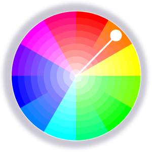
Monochrome
A monochromatic colour scheme contains a single colour hue with varying shades and tints, which are darker and lighter colours of the same hue (see Properties of colour in this resource for more about shades, tints and tones)
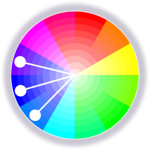
Analogous
An analogous colour scheme contains one main hue (colour) with the colours on either side of it on the colour wheel. For a five-colour scheme, it may also contain the two adjacent colours on the colour wheel.
Colour Bias is also related to analogous colour. This term refers to the way that a colour may be biased towards another adjacent colour on the colour wheel – for example, you may have a red hue that has an orange colour bias or a purple colour bias and is not a pure “red” colour. In fact, many pigments we think of as primary or “pure” colours actually have a colour bias and are not pure spectrum colours.
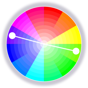
Complementary
A complementary colour scheme contains the two colour hues directly opposite each other on the colour wheel.
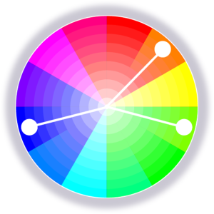
Split-complementary
A split-complementary scheme includes one dominant colour hue and two hues on either side of the dominant colour’s complementary hue.
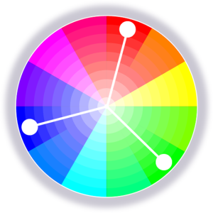
Triadic
A triadic colour scheme has three colour hues that are equally spaced around the colour wheel, forming a triangle shape.
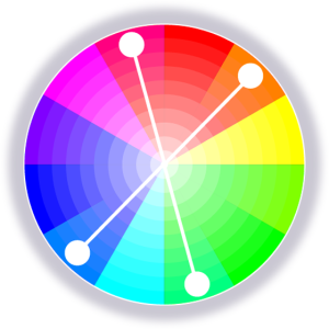
Tetradic
A tetradic colour scheme has four hues that form a rectangle within the colour wheel. There is also a quadratic scheme where the four hues form a square that is more evenly spaced than the tetradic rectangle, which could be any rectangular shape.
See Colour trends and palettes in this resource for a selection of colour palette generators.
The Dimensions of Colour Today: ICD 2022 (David Briggs)
This video is a recording of a talk by David Briggs, who is an Australian authority on colour theory. He bases the talk on content from his website The Dimensions of Colour , highlighting some developments in how we understand colour and colour relationships. He gives an overview of the alternative frameworks available today for visualising colour relationships. It is an academic video, but the imagery and diagrams make these complex concepts easier to understand. The YouTube page also contains links to all the resources and tools he references in the video. (34 minutes)
