Properties of colours
This page contains simple definitions of the basic properties or attributes of colours of objects and colours of light, which are useful to understand if you are working with colour applications and developing colour relationships or palettes. For further information, refer to The Elements of Colour by DJC Briggs[1], which provides a detailed illustrated account of these attributes including their scientific definitions.
Hue
Hue is a term that we use to classify colours of objects and colours of light into families that vary in other colour properties. The hue of any colour is the most similar pure colour around the colour wheel, such as red, or magenta, or greenish yellow. (“Pure” in this context means lacking perceived white, black, or grey content, as described in Tints, Shades and Tones below). So, for example, we might say that the hue of a brown wooden table is orange or yellow orange.
For a light, Hue is our perception of the dominant part or parts of the visible spectrum. For an object, Hue is our perception of the dominant spectral reflectance of the object.
(For “spectral reflectance”, see Why are things different colours?).
When we describe a light or an object as being “coloured”, we generally mean that it exhibits hue, and yet we may include black, white and grey, which lack hue, as “colours” in a practical sense – for example, when referring to paints or fabrics. Black, white, and grey are classified scientifically as “achromatic colours” [2], as opposed to “chromatic colours”, which exhibit hue.
Chroma and Saturation
Many people use Chroma and Saturation to mean the same thing, but according to the CIE International Lighting Vocabulary [3] they have different definitions that correspond to different aspects of colour intensity.
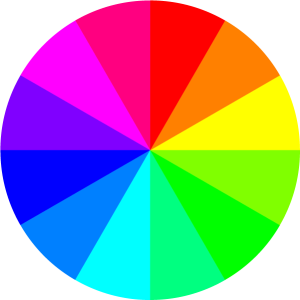
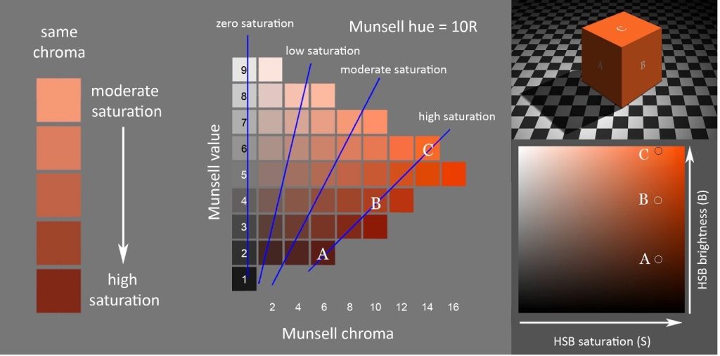
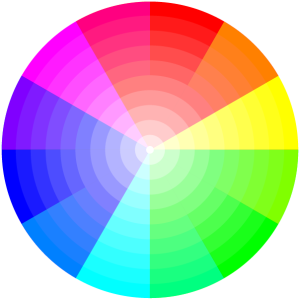
Chroma applies specifically to colours perceived as belonging to objects, and is the absolute intensity of an object’s colour, that is, the amount of difference from a grey of the same Value. In Figure 3.A, Chroma is represented by increasing distance to the right, beginning at zero for black, white and grey. In a colour wheel like Figure 3.72 the relatively “pure” colours on the circumference have the highest Chroma for their hue. However, the possible maximum Chroma varies greatly for different paints, inks and digital colours, and is not the same for different hues, and so distance from the centre in a symmetrical colour wheel like this normally shows relative rather than absolute Chroma.
Saturation on the other hand applies both to colours of light and colours of objects and is the intensity of colour (called Colourfulness; see below) of a light relative to its Brightness, or the intensity of colour (Chroma) of an object relative to its Value. An achromatic light or object exhibits zero saturation, a light exhibiting high saturation is perceived to consist of a relatively high proportion of coloured light to white light, and an object exhibiting high saturation is perceived to reflect/ transmit light of this character to the eye. The colours on the circumference of Figure 3.72 exhibit high Saturation (as well as Chroma), but so do darker colours that are high in Chroma for their Value (seen in Figure 3.75 below). “For an object to have high chroma it must reflect/ transmit saturated light in relatively large amounts.” [4].
Value/lightness and value/greyscale
Value, greyscale value and lightness are alternative names for the same property of colour. The Value of a colour is the most similar or least contrasting grey on a scale between black and white (Figure 3.73). In Figure 3.A, Value is represented by horizontal level within the diagram.
Like Chroma, Value applies specifically to colours perceived as belonging to objects. Value is our perception of the proportion of the light falling on an object that the object reflects. For example, a dark green object reflects less light and therefore has a lower value than a pale green object.
In a painting or a photograph, Value helps us greatly to identify objects as three-dimensional by representing the variations in light and shade on objects.
Brightness and Colourfulness
Brightness and Colourfulness are properties of colours we perceive as belonging to light, including the light reflected, transmitted or emitted to our eyes by objects, and the light falling on objects (the illumination). Brightness is our perception of the amount of light, and colourfulness is our perception of its intensity of colour. In contrast to colours of objects, which we saw can be described in terms of Hue, Value and Chroma (Chroma can often be called “Saturation”), colours of light can be described in terms of Hue, Brightness, and either Saturation in the scientific sense described above or Colourfulness.
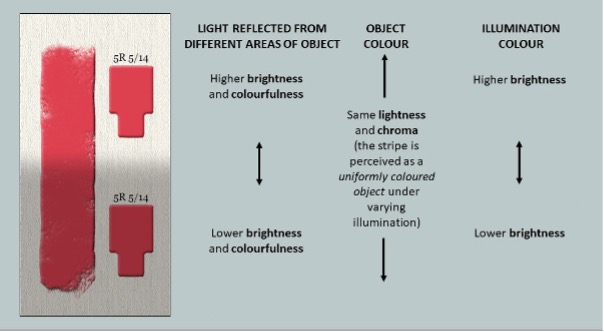
A uniform object under varying intensities of the same illumination will normally be perceived as having a uniform colour belonging to it (uniform Hue, Value and Chroma), while the light reaching our eyes from different areas of the object varies in Brightness and Colourfulness (Figure 3.73a). These variations in Brightness and Colourfulness are perceived as being imposed by the illumination rather than as belonging to the object itself. Illumination can also be perceived to exhibit Hue, Brightness and Colourfulness/Saturation, though the illumination in Figure 3.73a is perceived to be achromatic (white), varying only in Brightness.
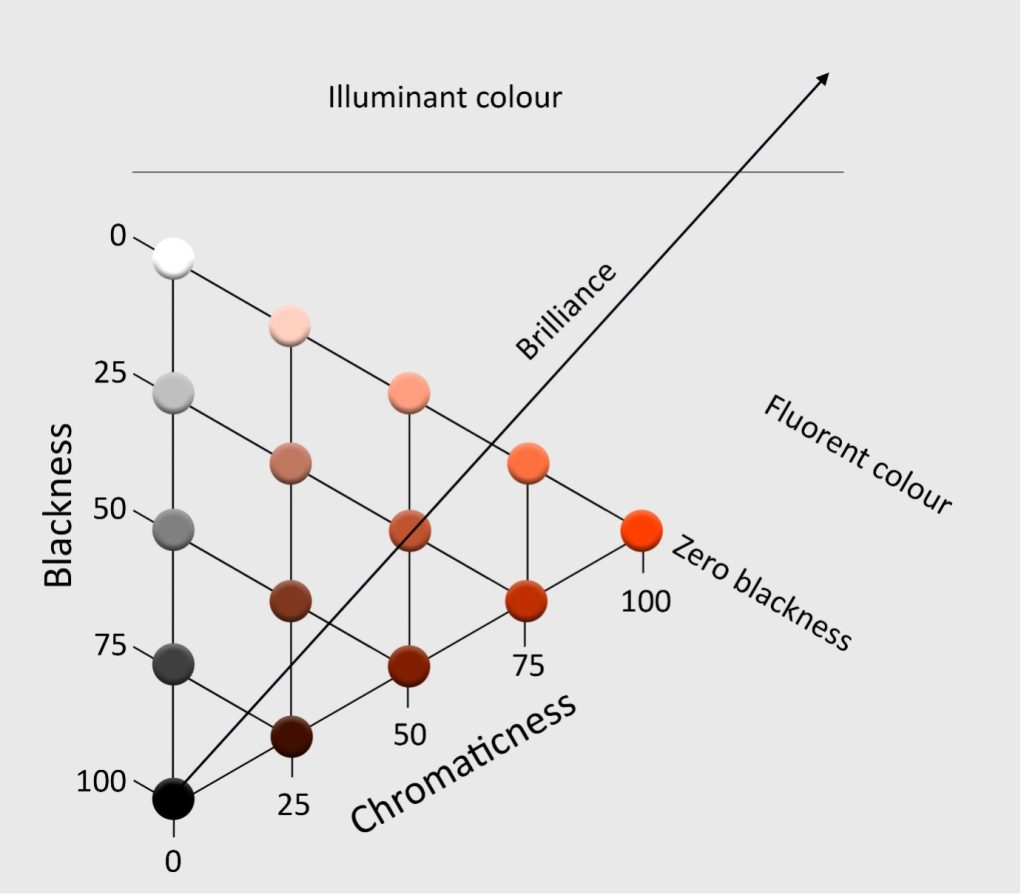
Blackness, Chromaticness and Brilliance
A different way to classify colours of objects, besides Hue, Value and Chroma, is according to their degree of resemblance to a pure black, a pure white and a pure colour. This is the basis of the Scandinavian Natural Colour System (NCS), in which these resemblances are taken to add up to 100 and plotted on a triangular diagram for each hue (Figure 3.Z, left), and colours of objects are specified by their resemblances to pure black and pure colour, called Blackness and Chromaticness respectively.
Colours of zero blackness, between a perceptually pure colour and white, lie near the approximate upper limit of commonly encountered colours of objects. As swatches increase in brightness beyond this limit, they take on the appearance of physical fluorescence, called Fluorence, and ultimately appear as self-luminous Illuminant colours. The scale of colour appearance from black through decreasing Blackness to zero Blackness, followed by Fluorence and then Luminosity is called “Brilliance” [6].
Tint
In traditional colour theory, the term “Tint” may be used for colours between a pure colour or “Hue” and white, or for physical mixtures of a coloured paint and white paint. In the first sense a Tint has the same hue as the pure colour and is between that colour and white in Value and Chroma. In the second sense, Tints may shift in Hue and pass through higher Chromas than the coloured paint.
Shade
In traditional colour theory, the term “Shade” may be used for colours between a pure colour or “Hue” and black, or for physical mixtures of a coloured paint and black paint. In the first sense a Shade has the same Hue as the pure colour and is between that colour and black in Value and Chroma. In the second sense, Shades may shift in Hue compared to the coloured paint.
Tone
In traditional colour theory, the term “Tone” may be used for colours between a pure colour or “Hue” and grey, or for physical mixtures of a coloured paint and grey paint. In the first sense a Tone has the same Hue as the pure colour and is between that colour and black in Chroma. In the second sense, Shades may shift in Hue compared to the coloured paint. The term “Tone” is also used in some countries as an alternative name for Value/Lightness.
- 1. Briggs, D.J.C., 2023. “The Elements of Colour”, Part One, https://aic-color.org/resources/Documents/jaic_v33_06.pdf and Part Two, https://aic-color.org/resources/Documents/jaic_v33_07.pdf. For additional illustrations and animations please see the related video presentations “The Elements of Colour”, https://www.youtube.com/watch?v=AtrRpGb-7FU, and “Colours of Objects and Colours of Light”, https://www.youtube.com/watch?v=ii9dWIG9nOY. accessed 03/01/2023 ↵
- CIE, 2022, achromatic colour definition - also known as "perceived colour devoid of hue", https://cie.co.at/eilvterm/17-22-049 ↵
- CIE 2023, International Lighting Vocabulary http://www.cie.co.at/ accessed 05/11/2023 ↵
- Briggs, D.J.C., 2018. “The Difference Between Chroma and Saturation", Munsell Color, https://munsell.com/color-blog/difference-chroma-saturation/ , accessed 03/01/2023 ↵
- 4. Briggs, D.J.C., 2017. “The Dimensions of Colour: Brightness and Colourfulness” http://www.huevaluechroma.com/016.php ↵
- Op. Cit. Briggs 2023, p.110 ↵
- Op. Cit. Briggs 2023, Part Two, Figure 10 ↵
