Mixing paint pigments
Pigments are not pure primary colours
Chapter 1 covered a history of colour theory that included the development of different systems of primary colours – like RYB, RYGB, RGB and CMYK. Learning about primary colours can help us understand how to mix different colours, but it doesn’t always help us to understand how subtractive colour mixing works in real and practical ways.
Most pigments (and dyes) are not pure primary colours. Pigments are made from substances that have a mixture of atoms that reflect a range of light waves. Paint mixing skills are important to learn in your creative practice.
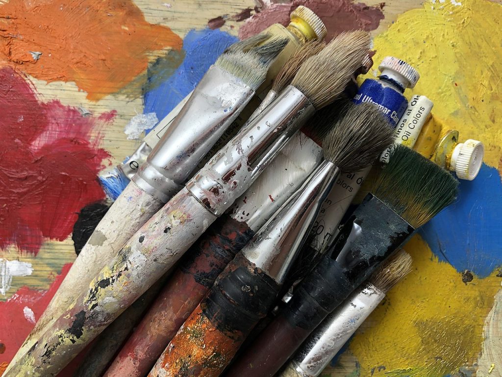
When you first learn how to paint – whether with watercolours, acrylic paints, oil paints or other types of mediums – you will usually start with a basic set of pre-mixed artist-quality paint colours that can be used to mix a wide variety of different colours.
A basic set of paint colours includes a mixture of warm and cool colours, and opaque and transparent colours.
Some examples of this might include:
- Two different reds: cadmium red is an opaque, yellowish red, and alizarin crimson is a transparent, blueish red.
- Two different blues: Prussian blue is dark, cool, and transparent, and cobalt blue is intense, warm and opaque.
- There are also many types of yellows and greens that are cool or warm, opaque or transparent.
- There are also different types of black and white paint, and a range of earthy colours like umbers, siennas, ochres and browns.
- You might also have violets and oranges in your paint set that can’t be mixed by combining other paint pigments.
- There are also other special paints that might have metallic or pearlescent pigments mixed with other colours or different paint mediums.
You can add to your basic paint set if you want more colours. Art materials suppliers have a large range of artists’ paints with many colours to choose from. However, you probably don’t need every colour available. Your particular colour palette will ultimately depend on the colours you want to use in your artworks. It’s good to learn how to mix your own colours and avoid only using pre-made colours straight from the paint tube or pot.
If you are studying painting, you will learn how to mix the different pigments in your paint set to achieve a wide range of colours and avoid muddy or dull colours – unless you want neutral or subtle monochrome colours. You can learn to mix many tints, shades and tones of warm and cool greys or browns from your paints. Learn more about colour properties from the Colour wheel in this resource.
There are different paint mixing methods to create many colours in your artwork, such as:
- physical mixing of two or more paints to create a different colour
- glazing, which is overlaying transparent layers of different coloured paints to create a new colour
- or by using methods similar to the Impressionist painters, who placed small dots or patches of colour next to each other to give the impression of another colour when viewed at a distance.
Artists’ paints are pigments that are mixed with different mediums:
- Watercolour paints are pigments mixed with gum arabic.
- Gouache paints are similar to watercolour but thicker and more opaque.
- Inks can be made with pigments or dyes and can have different mediums, like water, solvents, gels, gum arabic, or shellac.
- Acrylic paints are pigments mixed with an acrylic medium and there are different materials you can add to acrylics to make different textures for your paints.
- Oil paints are pigments mixed with an oil base, like linseed oil, but can also include waxes, pumice and solvents to create different thicknesses or textures.
- Enamels and lacquers are traditionally oil-based, with a hard, glossy finish – but you can also get acrylic resin-based versions.
- Resin – traditional resins were made from natural materials like tree sap. Synthetic resins use a two-part epoxy system that has a synthetic polymer and a hardener. Once combined, a chemical reaction occurs which turns the two liquids into a hard, solid material.
- Encaustic paint has a hot wax medium with pigments added to it.
- Other types of paint include: Tempera (egg yolk) and Fresco (wet plaster), which are not often used in contemporary creative practice because they must be made at the time of painting and are not practical to store or transport.
You can use more than one type of paint medium in an artwork, but it’s important to learn which ones work together. For example, you can put oil paint on top of acrylic paint, but not the other way around. You can, in some cases, use different oil-based paints together, and different water-based paints together, but depending on the thickness or glossiness of the paint medium, this doesn’t always work well. There is a lot to learn about painting methods and techniques!
Why does red and blue make brown?
Watch this video to learn more about colour pigment mixing…
You can also read this book to learn more about paint mixing:
Wilcox, Michael. Blue and Yellow Don’t Make Green. [2nd ed.]. Bristol: School of Colour, 2001. Print
David Briggs has a very detailed and technical explanation of colour mixing on his website: The Dimensions of Colour: Modern Colour Theory. Read the section about Mixing of Paints for more information.
![]()
The artist’s palette as a colour system
You can learn quite a lot about colour and painting techniques by studying the artworks of others. Some artists and art historians also like to delve deeper into an artist’s methods and processes by studying the paint pigments that the artist has used, and how they arrange their painting palettes to mix colours before applying them to their paintings.
Photographer Matthias Schaller has created a series of photographs of famous artists’ paint palettes – Das Meisterstück (The Masterpiece). He considers these to be a reflection of the artists’ work and has created over 200 of these images. You can view some examples on his website and in this Hyperallergic magazine article .
Digital tools have also been used to analyse the basic colour palettes of famous paintings to help artists and designers learn about colour relationships – view some examples here:
