Process (CMYK) and Spot (Pantone) colour printing
Colour printing can be complex and requires specific skills and knowledge to perfect. Print methods used depend on the type of print job and the colours you want to print.
Not all colours can be produced with Process colour (also called the four-colour process because of the four inks used – CMYK). Process colour printing mixes colours by laying down tiny dots in the printing process. Process colour is good for photographic images and complex images with subtle tones and shades, but it’s not good for some kinds of printing, like logos, packaging, or printing designs on fabric, like t-shirts.
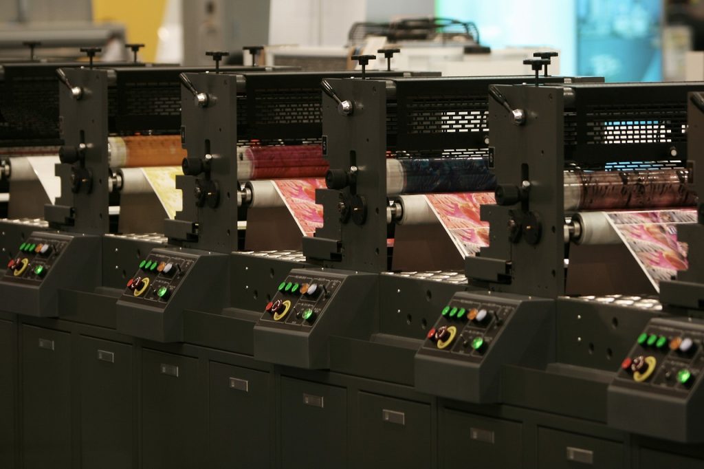
Spot colour is what we call it when pre-mixed colours are used in the offset printing method (Figure 3.28). This method is preferred when a small set of exact colours are needed – or if colours are needed that can’t be mixed with the process method – such as pastels, fluorescents, or metallic colours. Spot colours are solid colours and are usually made with the Pantone colour-matching system. There are 18 basic inks that are used to mix all the Pantone colours.
Some printing jobs use both Process and Spot methods to achieve the best result. For example, some company logos require a very specific spot colour which can’t be reproduced with process printing, so a spot colour is added to the Process colour printing to get the exact colour.
There is also a third printing method called Extended Colour Gamut process colours. This method is recent and not yet as popular. It involves adding additional colours (orange, green and violet – OGV) to the CMYK colour printing method to extend the number of colours (the gamut) that can be printed – CMYK+OGV.
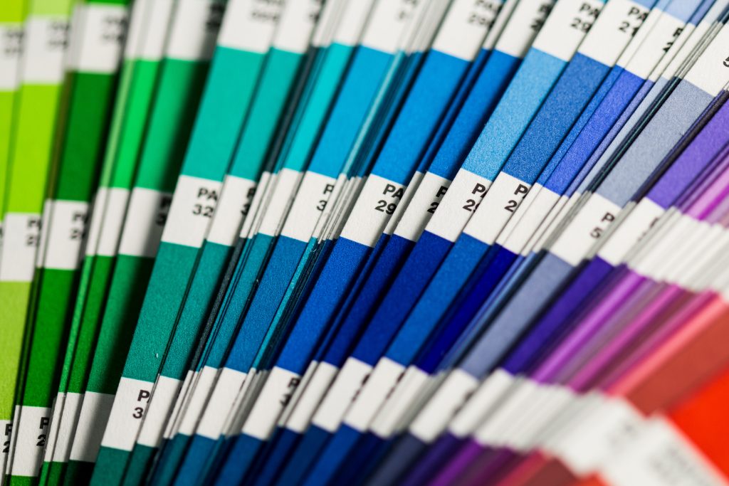
Designers often refer to Pantone colour swatch books (Figure 3.29) and online swatch charts to help select and match colours for printing. You will also find colour libraries, including Pantone, in your image editing software.
Visit these links for more information:
- Pantone: Spot vs process color
- Adobe: Spot vs process color
- Graphics Mob: How to find and add Pantone colors in Photoshop