Metamerism – colour perception and matching
Have you ever decided to wear all black clothes that look the same colour in your bedroom, but when you go outside, you notice they are all slightly different? Some black garments are more reddish-black, others slightly more green or blueish-black?
Have you ever chosen a carpet or paint for your home that you thought would match your furniture, but once you have it in your home, it looks completely different? It might also appear to be different colours between day and night, or on sunny or overcast, cloudy days.
These are examples of Metamerism, or in fact, illuminant metameric failure. The light in your home can be different colours from room to room and also a different colour to the sunlight outside. Some colours look the same under certain light sources but different under other light sources, which can include incandescent, fluorescent, LED or sunlight.
We could also say that colour blindness is a form of metamerism – observer metameric failure – because people see colour differently depending on their biology and the functionality of their eyes – as outlined in the sections on colour blindness and vision difference in this resource.
This also relates to the difference in colour on digital screens. You might design a website with a very specific colour palette, but you can’t guarantee that everyone who views your website will have a screen that is properly calibrated to accurately show the colours you selected. You can test whether your computer or mobile device is “colour blind” by following some of the steps on this website: Is Your Computer Color Blind?.
How does Metamerism work?
Metamerism is the term we use when colours match under one lighting condition but not another. Colours that do match in this way are called metamers. It’s based on the science of how different coloured substances absorb and reflect light, the amount of electromagnetic radiation, and which wavelengths of the visible spectrum are reflected or emitted.
A practical example of a colour metamer is using two different methods of creating orange paints that appear to be identical
You can create an orange paint by:
- mixing red and yellow paint pigments to create what the eye perceives as orange
- using a ready-made orange paint pigment that was made with different chemicals to the red and yellow pigments.
Your eyes will see the same colour even though the two oranges were created with completely different pigments that reflect slightly different light wavelengths.
When colours that should be the same don’t match under different lighting conditions and are perceived differently, this is metameric failure. Some colours are more prone to metameric failure such as whites, greys, beiges, blacks, pinks and mauves. This is where the science of colorimetry becomes important for testing colour consistency and the specific wavelengths of light reflected or emitted.
How to prevent metameric failures (colour mismatches)
If you are choosing fabrics for a fashion collection and you want them to match, you should collect swatches and samples of fabrics and accessories that will go together in an outfit or ensemble and lay them out under different lights to make sure they match and look good together.
For example, you might think you have the perfect matching zip, buttons, sewing thread and bias binding for a cotton dress, but these items are made from different materials (nylon, plastic and metal) to the cotton dress fabric. They might look the same in one type of light, but if you look at them under a different light source, they might reflect different amounts of light wavelengths and appear different to your eyes.
This is because the dyes and pigments colouring these materials may have slight chemical differences and therefore reflect light differently.

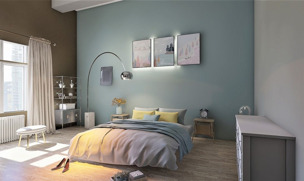
For the same reason, if you are decorating a house, it’s a good idea to try sample paint pots or get carpet and fabric samples and put them on the floor or walls to make sure you have the right colour for the environment and where the light falls. You also need to check if the colours match under daylight from the windows and under the artificial lights in your home.
With digital media, it’s impossible to know if your viewers have screens that are calibrated. It can help to test your website on as many different types of screens and, if possible, older technology, where screens might not work that well or may not have good brightness and contrast. This way, you will know if your colour designs will look good under different conditions that are out of your control. You could also encourage your audience to take the computer colour blindness test mentioned above.
