Colour aesthetics in art and design
Early Modern Art
Goethe, Chevreul and Ostwald (See 1.1 History of colour theories for more details) did not have an ongoing influence on colour theory from a scientific perspective. However, they did have a lasting influence through the works of artists who were concerned with colour aesthetics, psychological colour and subjective colour from the time of the Impressionist movement, through to the Abstract Expressionist and Colour Field painters of the 20th century.
Research and reflection activity:
It’s easy to find resources about early modern artists and their work with colour in art books and online publications.
Here is a small selection of artists from the Impressionist, Expressionist, Fauvist, Orphic Cubist, and Futurist movements who made significant contributions to the development of modern theories of colour in visual art.
Research three of the artists listed here – select artists’ names to open a Google search in a new browser tab, and learn more about them and their work with colour:
- Claude Monet
- George Seurat
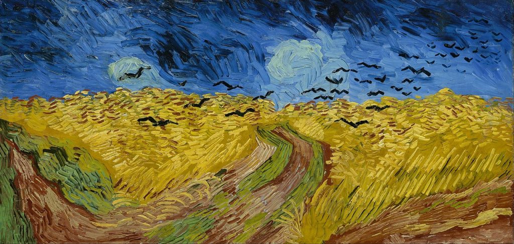
- Vincent van Gogh (Figure 1.37)
- Paul Cezanne
- Henri Matisse [1]
- Andre Derrain
- Sonia Delaunay
- Robert Delaunay
- Giacomo Balla
- Umberto Boccioni
Do you have a favourite artist from this time?
How does colour play a role in their work?
Does understanding other artists’ creative practices help you to develop your own practice?
The Bauhaus influence
The German Bauhaus school (1919-1933) was an important site for experimentation and exploration of the aesthetics of colour and form, and how colour is subjectively perceived in different contexts. The work done by key designers and artists associated with the Bauhaus school is still influential.
Practitioners listed below all taught colour curricula at the Bauhaus school. They all had their own ideas and theories about colour aesthetics. Select artists’ names to open a Google search in a new browser tab, and learn more about them and their work with colour:
The traditional primary colours: Red, Yellow and Blue, and the associated secondary and tertiary colours on the traditional colour wheel, formed the colour model used by Johannes Itten, Josef Albers[2] and others (Figure 1.38) as a basis for the Bauhaus colour curriculum, and for other schools influenced by the Bauhaus.
Albers and Itten both had a keen interest in colour relationships and how colours appear when placed side-by-side.
Color is changing continually: with changing light, with changing shape and placement, and with quantity which denotes either amount (a real extension) or number (recurrence). And just as influential are changes in perception depending on changes of mood, and consequently of receptiveness.[3]
Publications by Albers and Itten are still referred to in art schools today. You may find copies of these books in art and design school libraries:
Josef Albers, Interaction of Colour, Homage to the Square
Johannes Itten, The Art of Colour
Mid-century Modern: into the colour field
In the mid-20th century, artists associated with Abstract Expressionism, Colour Field painting and Post-painterly Abstraction were working without figurative elements, using colour as the main feature of their paintings. Select artists’ names to open a Google search in a new browser tab, and learn more about them and their work with colour:
- Mark Rothko
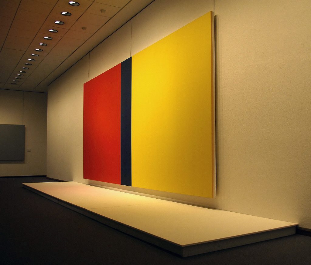
- Barnett Newman(Figure 1.39)
- Kenneth Noland
- Clyfford Still
- Helen Frankenthaler
- Frank Stella
These artists, and many others from the modern period, created significant artworks that have influenced creative practitioners of all kinds since that time. In the 21st Century, we continue to research and study these artists’ works because of their impact. Students of art and design can learn much from exploring their use of colour.
In Australia, there was a significant shift to abstract and colour field painting in the 1960s. The National Gallery of Victoria held an important and controversial exhibition titled “The Field” in 1968 which coincided with the launch of the new modernist gallery space in St Kilda Road (the current NGV International gallery).
This was a landmark exhibition which showcased the new work of young and emerging local Australian abstract artists. In 2018, this exhibition was re-staged at the NGV International space titled “The Field Revisited”. Read about it here in this ABC News article, and visit the NGV website page to see examples of the abstract artworks and the artists that created them.
Research and reflection activity:
Research two of the artists working with abstraction listed in this section, and see if you can find two more artists from the NGV “The Field” exhibition.
- Do you have a favourite abstract artist?
- How does colour play a role in abstract painting?
- How does understanding these artists’ creative practices help you to develop your own practice?
Note: the artists and designers listed on this page were not the only ones working with colour in new and experimental ways: this is an introduction to selected key figures in art and design. See linked resources and subject guides for more information on this topic.
Further resources:
David Briggs’ website The Dimensions of Colour contains extensive academic and scientific information about colour theory. These two sections are particularly relevant to this page as they discuss modern colour theory:
- 11.2 Traditional and modern colour theory part 1: Modern colour theory
- 11.3 Traditional and modern colour theory part 2: traditional colour theory strikes back!
- also see Matisse's publication Notes d’un peintre, 1908 (English version)(opens as a PDF file ↵
- RMIT students can access this video on Albers: RM, A. (Producer), & Moritz, R. (Director). (2012). Josef Albers - Homage to the Square: Against Deep Blue. [Video/DVD] ArtHaus Musik. Retrieved from https://video.alexanderstreet.com/watch/josef-albers-homage-to-the-square-against-deep-blue ↵
- quote by Josef Albers (Written ca. 1954 and published in numerous catalogues and articles and in various languages) ↵
