Colour charts – Pantone and Munsell systems
The colour systems currently used in creative and design industries for selecting and matching colours with a high degree of accuracy are produced by Pantone and Munsell.
Pantone colour is a dual system that displays charts or “guides” of proprietary colours that are described with different information, such as CMYK values and Pantone spot colour identifying codes.
The Munsell colour system is different to Pantone – it is a way of classifying visible colours with a number system. A colour could be classified in both the Munsell system and in a Pantone colour guide.
This resource cannot display more than a few selected images, as both of these systems are under the copyright of their companies. Their websites and related links provided on this page, however, do have detailed information about how these systems work, and how you can use them in your creative practice.
Pantone colour
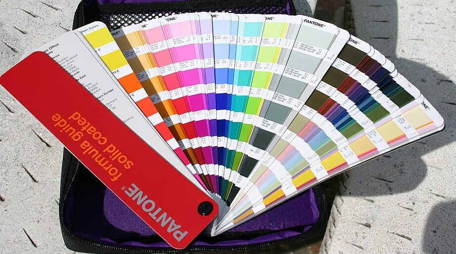
The image in Figure 3.77 displays a sample taken from a Pantone colour guide. The whole digital chart would be too large to display here. You can find more complete examples on the Pantone website.
This online resource also has a web version of the Pantone PSM colour chart . Keep in mind that any digital Pantone chart will not necessarily show the exact colour you will see when printed. The reason hard-copy swatch books are used in the design industry is that they show the exact physical colour of a Pantone pigment. It is also advised that swatch books are updated regularly, as some pigments may fade or change over time and not show accurate colours.

Munsell colour system
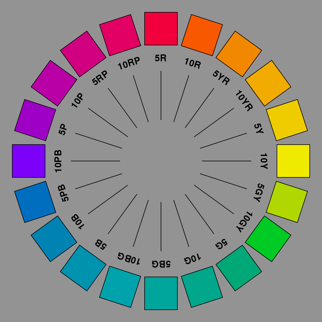
The image in Figure 3.78 is a sample of the twenty basic hues in the Munsell colour system. Each of these hues has a colour chart showing the different value (lightness or darkness), chroma (saturation or brilliance) and relationships between the colours. Learn more about the Munsell colour system from the Munsell Color website
Andrew Werth has created a Virtual Munsell Colour Wheel that allows you to browse Munsell colour notations – a useful tool for designers. Each colour in this tool has the Munsell colour notation, plus RGB and Hex values.
Hue is the term that we use to classify colour. For example if we describe something as "red" or "magenta" or "greenish-yellow", that is the hue. In physics, a specific wavelength of light is a hue. Black, white and grey are not hues, although we may call them colours in a practical sense, for example, when referring to coloured paints or fabrics.
Colour Value is also known Brightness: this value is different to Lightness – it relates to how bright a colour is, not how light (pale) or dark a colour is.
Chroma is the absolute colour of the object irrespective of its relative appearance - it's the attributes we see as belonging to the object itself. "For an object to have high chroma it must reflect/ transmit saturated light in relatively large amounts."[1]


