Colour grading in photography and film
Since the beginnings of colour technologies in photography and film in the late 19th Century, attempts have been made to create realistic and accurate colour representation in photography and film.
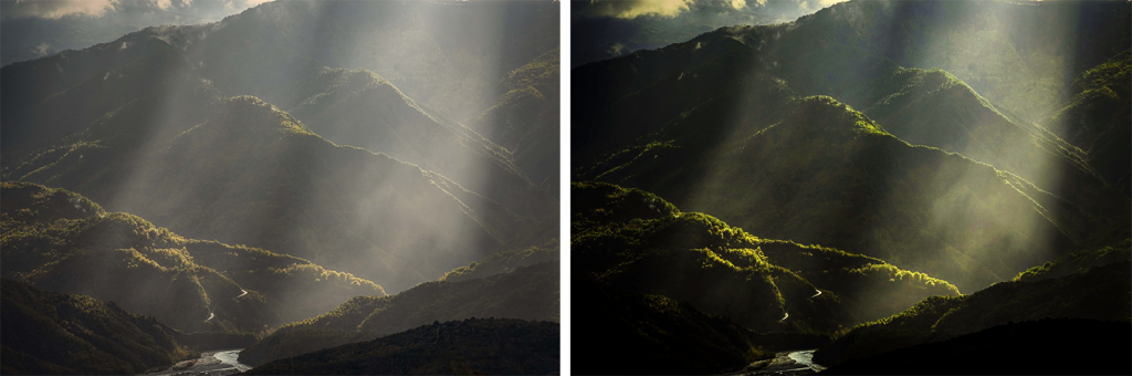
Colour grading is the manipulation of colour to emphasise or de-saturate certain colours and adjust contrast, shadows and highlights. It is used to enhance the mood, emotion, or visual style of an image or film.
The practices of colour grading and colour correction began with traditional photography and film and continue to this day with digital media production.
This page covers a selection of important developments in the production of colour photography and film:
Topics:
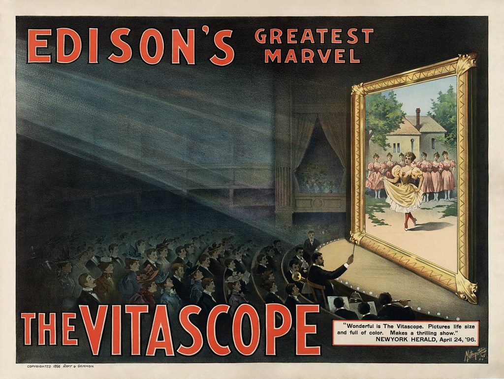
Technicolor
You may have seen old movies that list Technicolor in their credits, such as The Wizard of Oz (1939, Victor Fleming, Metro-Goldwyn-Mayor) or The Red Shoes (1948, Michael Powell & Emeric Pressburger, The Archers).
Technicolor is a trademarked process for colour motion-picture that dates from 1932. The original process captured three black and white films at once using a very large and cumbersome camera with a light-splitting cube to capture red, green and blue light on each film. It then used a dye process to produce an opposite colour print – the red film becomes a cyan print, the green becomes a magenta print, and the blue becomes a yellow print. When the three colour films were laminated together, they reproduced something close to natural colour.
Watch this video for more details:
How Technicolor changed movies (Phil Edwards, Vox)
You can learn more about Technicolor from the Eastman online research archive.
The history of colour photographic test cards and racial bias
In the 1950s, cameras and colour film became cheaper and more available for anyone to use. The companies that made photographic film and the printers that produced photographs from the negatives required methods for testing whether the colour was accurate and realistic. At that time, the Kodak company had a monopoly on colour film and photographic printing in the western world.
The method of colour testing for photographic printing used images of people (usually women) on the test cards to ensure skin tone was accurate. This was problematic because Kodak originally only used models with white skin as testing controls. This means that there was bias in the way colour film presented people with darker skin tones.
These test cards were known as “Shirley cards”, because that was the name of the original model used in the Kodak skin tone standard cards.
It wasn’t until the mid-1990s that Kodak developed a multiracial Shirley card, but this was partly because companies that manufactured chocolate and wooden furniture had been complaining for years that photographic prints weren’t showing enough variations in the dark brown tones of their products.
Fuji film became the film of preference for photographing darker skin tones at that time, possibly because their colour processing favoured a different range of skin tones.
Watch this video to learn more:
Colour film was built for white people. Here’s what it did to dark skin.
It is fair to say that early colour film and printing techniques didn’t have the same range of colour dynamics as we have now, and couldn’t produce the best skin tones across all skin types. However, it is evident that the way chemical processes were developed at the time favoured showing light skin tones more accurately than dark skin tones.
Learn more about this topic from artists Hito Steyerl and Rosa Menkman: Behind White Shadows.
Colour grading film for skin tones
More recently in cinematography, colourists have developed digital colour grading techniques to better represent all skin types without losing quality or stylised colour effect. Some significant examples of using colour grading in moving images to portray dark skin tones include the films Moonlight (2016, Barry Jenkins dir.) and Black Panther (2018, Ryan Coogler dir., Marvel Studios).
Watch the trailer here to see the different colour gradings used in this film:
Moonlight | Official Trailer
Moonlight director Barry Jenkins engaged colourist Alex Bickel, to create a colour grade for the film that increased contrast and colour saturation while preserving detail. The three chapters of the film were designed to look like different film stocks:
- Chapter 1 imitated the Fuji film stock to highlight the cast’s skin tones.
- Chapter 2 imitated the Agfa film stock, which increased the cyan colour.
- Chapter 3 imitated a modified Kodak film stock.[1]
Colour grading techniques in digital photography and film
You may have already used filters on your own digital media to adjust and enhance the colour of a photograph or video for social media or before you print it. Most image-capturing apps now have a range of colour filters that can immediately change the look of your image in many ways.
This is simple colour grading, and the same principle is applied to professional photography and film – although the processes can be much more technical and customised. Almost all films and TV series have colour grading applied to them. It can be surprising to see the original footage captured in the camera compared to how it looks post-production.
Colour grading in film and video is an art, and colourists are skilled in manipulating colour using a range of digital techniques.
Colour correction is not the same as colour grading. Colour correction involves fixing problems with the original captured imagery, like editing out skin blemishes or matching colour between different scenes in a video, for example. Colour grading is more about the overall colour and visual style of the image or video.
You might have noticed that some movies you watch have a lot of deep blue and green tones, while others might have orange and cyan tones, very black shadows, or very vibrant reds. With colour grading, deliberate choices are made to adjust the hue, saturation, contrast, highlights and shadows of still or moving images to enhance drama or match visual themes.
All image and video editing applications currently used in the digital media industry have colour grading tools. Anyone working with digital photography and film can learn how to use these tools and apply colour grading to their digital media projects.
Activities:
- Make a list of your three favourite films or TV drama series and analyse the colour grading in the video. It is likely that none of your choices are using film or video straight from the camera without any colour grading – unless you are watching a Dogma 95.
- Are the colours similar or different in each of your selected videos?
- Do certain types or genres (Action, Romance, Comedy, Sci-fi, Horror etc.) have the same colour style?
- How does the colour add to your experience of what you are watching?
- How can you improve your own images and videos with deliberate colour grading?
- Explore the filters on your mobile device apps or the colour editing settings in your image or video editing software and experiment with adjusting the colour in your own photos and videos.
You can learn more about colour grading for video by doing these short LinkedIn Learning courses (free for RMIT students with login):
- Creating a short film – 11 – color grading
- Colour grading footage in-After-Effects
- Introduction to video color correction – understanding color theory
- >O'Falt, C. 2016, "‘Moonlight’ Glow: Creating the Bold Color and Contrast of Barry Jenkins’ Emotional Landscape", IndiWire, 26/10/2016, <https://www.indiewire.com/2016/10/moonlight-cinematography-color-barry-jenkins-james-laxton-alex-bickel-1201740402/> accessed 10/11/2022 ↵
A colour filter in traditional photography would be some kind of transparent glass or plastic that would absorb certain colours of light and change the image that is captured. In digital media, a colour filter is usually a file that has information that when applied to a digital image, can adjust the colour properties such as change the saturation of certain colours, change the lightness and contrast, etc.
Post production editing means work done on an image, film, video or audio recording after capturing the media. This could be work done to a physical or digital object and may include colour grading, colour correction, special effects, titles and soundtrack etc.
