Colour management – what can go wrong?
Colour management is important to ensure colour is accurately represented across digital devices, screens and printing processes. It’s useful to know about if you are a graphic designer, photographer, printer, or any kind of colour worker.
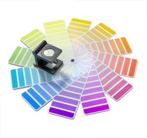
This chapter has covered working with colour from a range of perspectives, like colour gamuts and systems, different kinds of digital media devices, and printing methods. All of these elements are affected by colour management. Sometimes, things can go wrong in colour processes – especially when transferring images between devices or outputting to printers.
What can you do to improve your colour management?
If you know what can go wrong, you will know what to look out for and how to solve any problems that might happen. Here are a few things that you can check in your own colour workflow processes that might be creating colour problems for you:
- Screen colour problems (Calibration)
If you are working with an old computer screen/monitor, or one that isn’t calibrated properly, you may not be able to see the correct colours in your digital media. Try calibrating your device screen to get the colours as accurate as possible. See How digital screens display colour in this resource for more information. - RGB to CMYK (Conversion)
Not converting RGB images to CMYK before printing, as mentioned in Do I need to convert an RGB image to CMYK to print it? in this resource. - Image editing in CMYK instead of RGB
This will not show you accurate colours on your computer, and may not let you use all the editing functions of your software. Check that you are editing your image in RGB to get the best results. - Colour loss from conversion
Understanding the different colour systems and colour loss when converting from RGB and CMYK is useful. RGB is a bigger colour gamut than CMYK, so not all colours transfer from digital to print. - Do you have the right colour profile?
If you’re not using the right colour profile or library when creating/editing your digital images, your colour may not print accurately. Learn about colour profiles here: Adobe: working with colour profiles - Colour correcting
Learn how to use colour pickers and HSB settings to change the saturation or brightness of colours and adjust your images where necessary. See Other RGB colour models in this resource for more information. - Double colour management
If your software and printer are both applying colour management to your image, you could end up with bad colour outputs – for example, your reds look too pink. Check your colour settings in your editing software and your printer. - Proofing and paper stock
Print a sample (proof) first to check your colours and see how they look on different types of paper – then you can adjust your colour if it’s not looking the way you want it to. Different types of paper can affect how your colours print too.
Learn more about colour management issues here:
