Assigning volunteers to work areas
Many people are interested in helping out at the festival, but do Sammie and Hayden have enough volunteers to staff each of the required areas? See how Sammie uses a Venn diagram to assign volunteers based on their preferences…

![]()
The Salty Creek Community Festival has received a steady stream of interest from prospective volunteers, and it’s time for festival organisers Sammie and Hayden to figure out if they have enough general volunteers to staff each of the three areas: cleaning and rubbish pickup; health support at the first aid tent; and ticketing and giving directions.
The festival needs 47 volunteers and has received 48 applications. Each applicant was asked which areas they would be willing to work in. Hayden has tallied the results in this table:
| Health only | 9 |
| Cleaning only | 4 |
| Ticketing only | 6 |
| Health or cleaning | 8 |
| Cleaning or ticketing | 12 |
| Ticketing or health | 5 |
| Any area | 4 |
The festival will need 22 volunteers to clean and pick up rubbish, 15 health volunteers at the first aid tent, and 10 volunteers for ticketing and giving directions. Are there enough volunteers for each area?
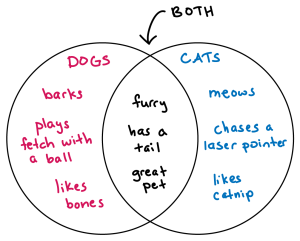
With so many bits of information, Sammie suggests visualising it all with a Venn diagram. A Venn diagram is a way to clearly organise information when there are overlapping categories. Sammie explains that where the circles of the diagram overlap, so do the categories represented by each circle. They draw a diagram to illustrate:
Help Sammie and Hayden visualise the volunteers’ preferences by entering the number of volunteers in each space of the Venn diagram below. Then, calculate the number of volunteers interested in each of the three areas. The first number has been entered for you.
Volunteer preferences fill in the blanks transcript
It looks like there are enough volunteers for each area, but the totals calculated above can be misleading because many volunteers are counted twice. Sammie shows Hayden their method for assigning the volunteers, turning the numbers into dots and using a different colour for each category. This will help them see if they can assign enough people to each area: 22 in cleaning, 15 in health, and 10 in ticketing.
Drag the slider to see how Sammie assigns a colour to each area and then adds volunteers to each area by dividing up those from the overlapping sections of the Venn diagram.
With the Venn diagram they’ve created, Sammie and Hayden can see that they will have enough volunteers to staff each area of the festival. They even have one extra set of hands! Visuals like Venn diagrams can help you wrap your head around complex information and the relationships between ideas. They are a great tool for brainstorming, taking notes, and even calculating probabilities.
Learn more on Learning Lab
- Using Venn diagrams in maths? Learn more about these and other ways of displaying information on the Sample Spaces page, and practice your probability skills with related exercises. (10 minutes)
